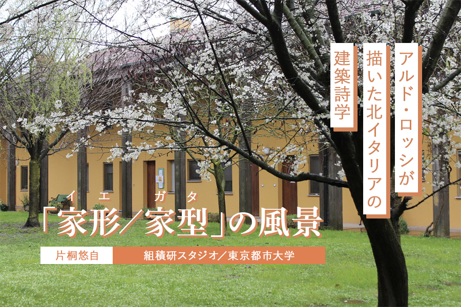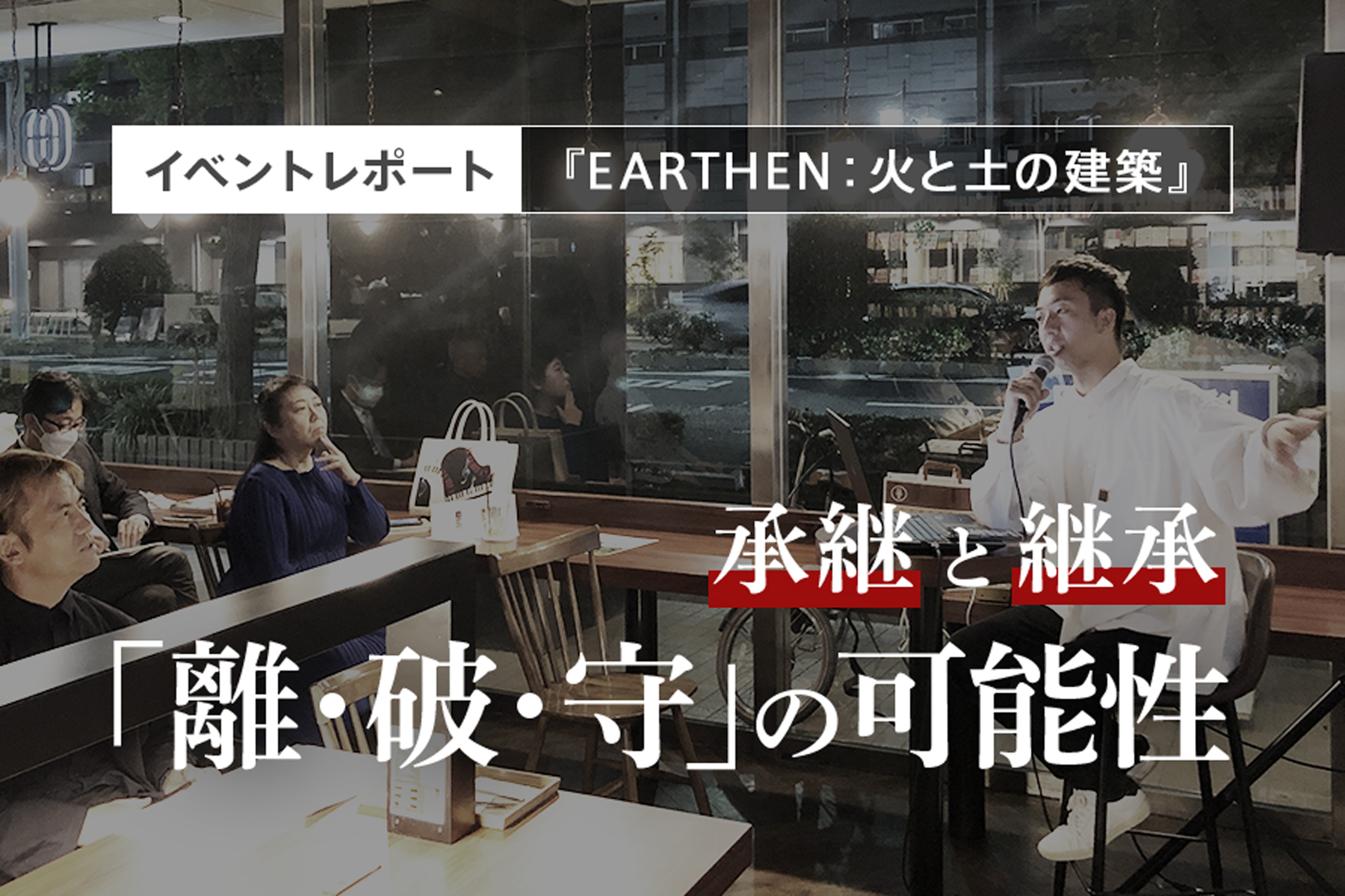
庭師・梅野星歩による「EARTHEN:火と土の建築」レポート
梅野星歩
ヒトツチ
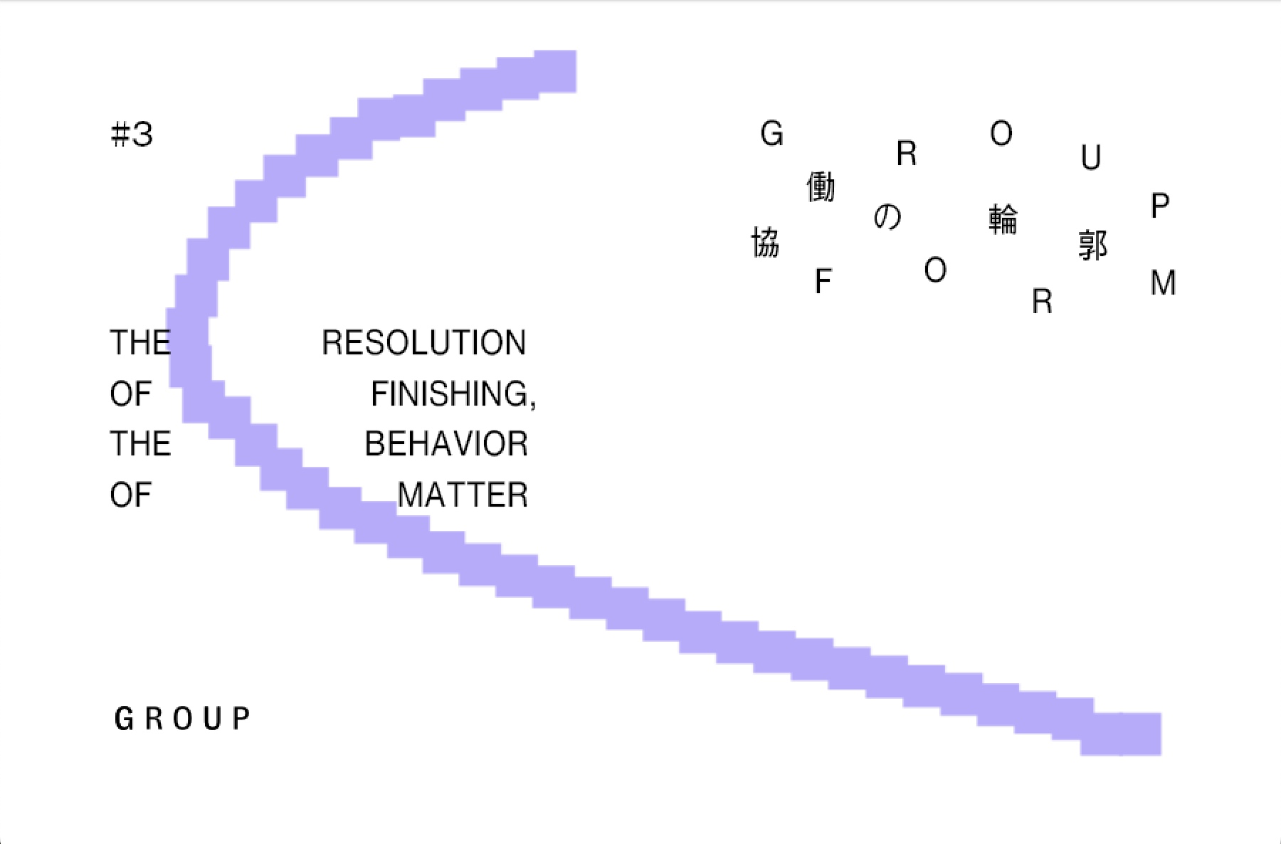
建築と美術の現場を行き来しながら、協働というプロセスが作品やプロジェクトに与える影響を探る連載「協働の輪郭」。第3回は、グラフィックデザイナー・岡﨑真理子を迎え、建築とグラフィックにおける「仕上げ」の工程を起点に、平面と立体の関係、そして仕事の広がりについて話をした。
岡﨑真理子
グラフィックデザイナー。1984年東京生まれ。慶應義塾大学、Gerrit Rietveld Academie(オランダ)卒業。neucitora、village®を経て2018年よりフリー、2022年REFLECTA, Inc. 設立。現代美術やパフォーミングアーツ、建築、ファッション等の文化領域に深くコミットし、観察とコンセプチュアルな思考に基づいた、編集的/構造的なデザインを探求している。近作に、第8回横浜トリエンナーレ、EASTEAST_TOKYO 2023/2025など。2024年にJAGDA新人賞、東京TDC賞受賞。
岡﨑真理子(以下、岡﨑):
最初に井上くんが連絡をくれたのは、ある建築家の作品集をつくりたいっていう話だった気がする。そこから、グラフィックデザイナーの小林すみれさんの展覧会をしていた竹尾の青山見本帖で会ったんだよね。
GROUP:
編集を頼まれていた書籍のグラフィックデザイナーとして、岡﨑さんを推薦していいか相談させてもらったんですよね。でもちょうどコロナになっちゃって、書籍の企画そのものがなくなりました。
岡﨑:
建築家の本のデザインを、独立して間もない自分がやることになるかもしれないということに、まず驚いたんだよね。その頃は独立して1〜2年目だったので。
GROUP:
その建築家は、若い人と書籍をつくりたいとおっしゃっていましたよね。僕たちと岡﨑さんは独立した時期も近くて、2019年頃です。そこから岡﨑さんは、みるみる間に活躍の場を広げていった印象があります。
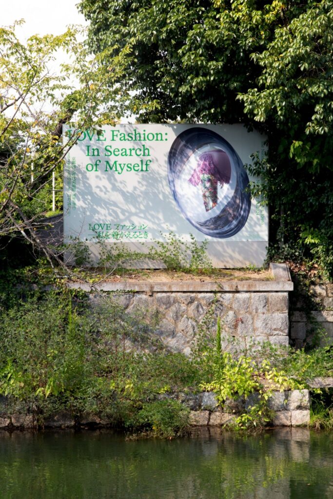
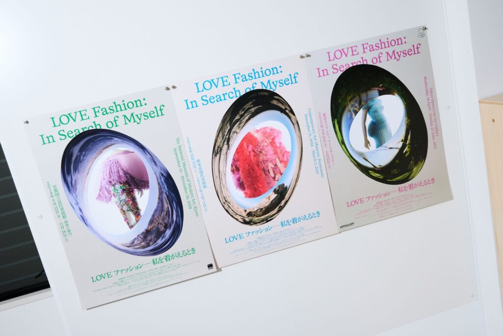
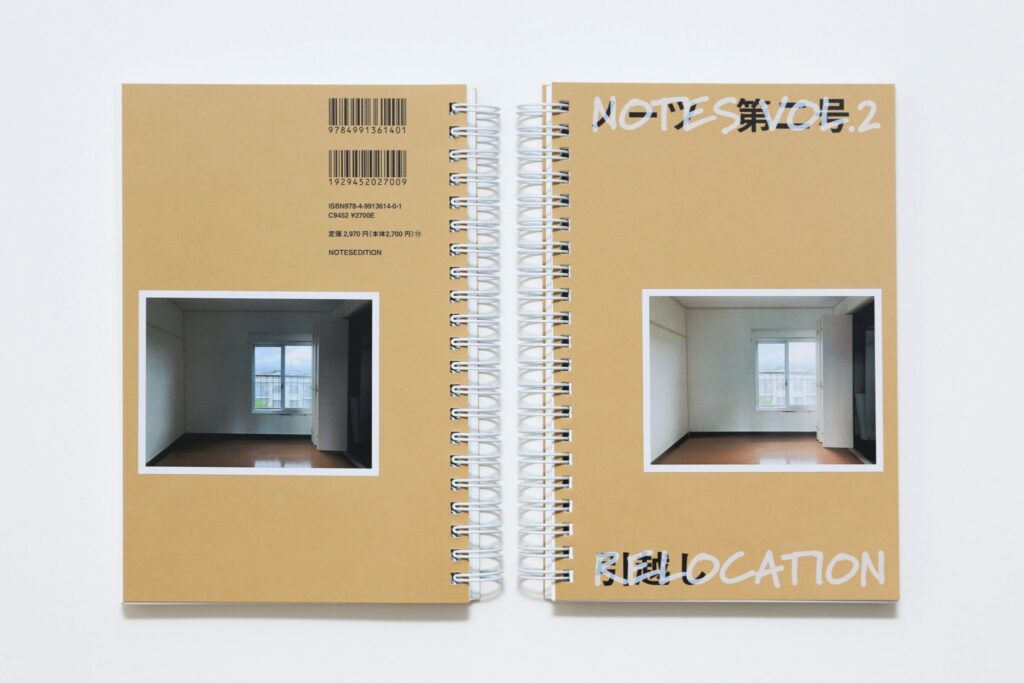
雑誌『ノーツ』の第1号・第2号、アートフェアEASTEAST_TOKYOの第1回・第2回、京都国立近代美術館、熊本市現代美術館、東京オペラシティアートギャラリーを巡回したファッション展「LOVEファッション─私を着がえるとき」、2024年JAGDA新人賞展など、いろいろなプロジェクトをご一緒しました。
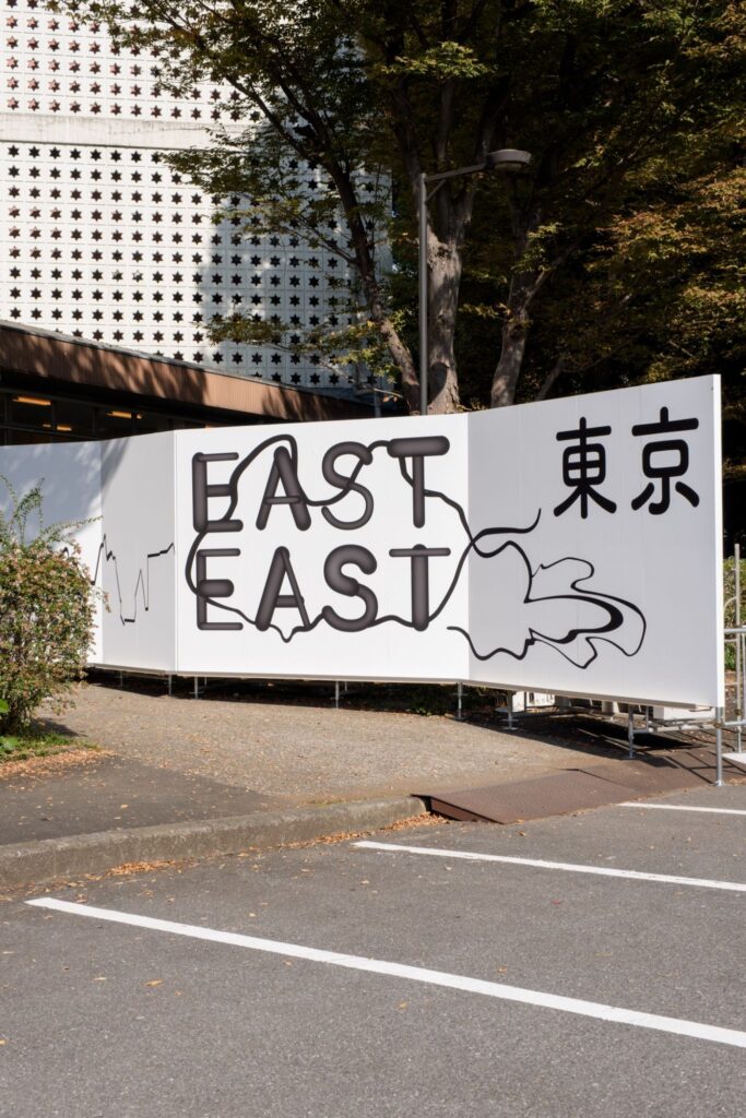
まず最近協働したアートフェア、EASTEAST_TOKYOの話をしましょう。第2回開催となる今回、GROUPでは、グラフィックデザインの効果が最大化されるような会場設計を意識していました。
岡﨑:
うんうん。 それがうまく噛み合った感じがあった。グラフィック制作の途中で、すでに進んでいた一筆書きの展示計画を見せてもらって、そこからさらにグラフィックのイメージを膨らませていった。今年は前回に比べてデザインの足がかりが少なかったから難しかった。前回はEASTEAST_TOKYO自体にやりたいことがたくさんあって、それを形にする感じだったけど、今回は前例がすでにある中で、理念が同じならどう変えるか、というのがすごく難しくて。
事務局から会場設計が決まりそうだと聞いて、河川敷というイメージと、一筆書きで全部つながっていく展示計画の話を聞いて、じゃあそれに合わせよう、となった。今回は完全に会場デザインから発想したグラフィックです。
GROUP:
なるほど。
岡﨑:
そこから生まれたグラフィックデザインにGROUPがまた合わせてくれた。お互いが作ったものを受けて、また返す、という関係がうまくいったと思います。実際の会場設計もすごく良かった。前回も良かったけど、今回はよりファインで、きれいな印象になった。
GROUP:
今回は「破綻」が少なかったですよね。前回はあえて裏側まで仕上げて見せる設計でしたが、今回はすべてを仕上げきった。その違いもあったかもしれません。
GROUP:
建築でいう「仕上げない」という言葉は、支持体を見せたり、合板をそのまま表すようなことを指します。グラフィックデザインにも似たような考え方はありますか。
岡﨑:
最終形を整えすぎないということはあるかも。一歩前のところでやめておくこととか、グラフィックとして出来上がったものの質感をどれぐらいファインにして、どれぐらいラフにするかという判断はある。
例えばフォントの選定でも、綺麗に作るものと、ラフに作るものの選択があって、例えばラフにつくる場合はネットに落ちてるジャンクなフォントを使うとか。 あとは、印刷面の素地をどれくらい見せるかとかかな。
GROUP:
印刷面の素地、というのは?
岡﨑:
例えば『ノーツ』で使ったリソグラフだと、インクが紙に染み込んだ感じが出る。ベタ面で刷ると、紙目にインクが入り込んでムラになる。
オフセットでも線数を下げることで、シルクスクリーンに近い粗さを出すことができる。パソコン上ではツルツルだったものが、印刷の工程でどう変化するかを考える。一番最後のプロセスでテクスチャーをコントロールすることが、仕上げにあたるのかな。
GROUP:
グラフィックの仕上げというと、貼り方の工夫などを想像していましたが、もっと手前にあるんですね。
岡﨑:
貼るところは普通はコントロールできないから。印刷して配って、その先は割とどうにでもなっちゃう。グラフィックの最終段階はやっぱり印刷だと思いますね。
GROUP:
JAGDA新人賞展では、岡﨑さん、坂本俊太さん、山口崇多さんの三者で展示をつくりましたね。巾木だけを共通ルールとして決めて、あとはそれぞれの要望を聞くかたちでした。
岡﨑:
これまでのJAGDA新人賞展って、受賞者を完全にごちゃ混ぜにしてひとつの部屋を作る年もあれば、分ける年もあって。我々は完全に分かれていた。
GROUP:
完全に分かれてましたよね。 3人ずつの個展を3つやってるような形式だった。それぞれかなり異なるキャラクターをそれぞれの室に反映させなきゃいけなかった。
岡﨑:
GROUPに対して私からは、本を開いた状態で作品をたくさん見せたい、上部にポスターを吊る予定がある、ということだけ伝えました。そしたら、ポスターのピッチに合わせて什器の構造を提案してくれた。巾木も面白かった。
GROUP:
気づいた人は少なかったかもしれませんが、それも良いですよね。各部屋で巾木が違うことで、空間の印象が変わりました。
岡﨑:
それぞれの人らしさがある巾木だった。
GROUP:
本棚もサイズや構造を検証しながら一緒に考えましたね。
岡﨑:
最初はクリスマスツリーみたいな棚だったんだよね。
GROUP:
そうそう。それをもうちょっと洗練させていった感じです。最初は横長の本棚だったじゃないですか。 普通に作ると柱として縦の木材が出てきちゃう。今回はその構造体を後ろ側においてみたんですよね。そしてその構造体が上部に吊られているポスターの並べ方に揃った配置になっている。
岡﨑:
そうだね。フレームに板が乗った感じになる。この本棚が真ん中にあることで、空間の中で展示の中心ができた感じで良かった。
GROUP:
岡﨑さんの展示は部屋の中で立体的に混ざっていきますよね。その中で、どのようにお客さんの動線を作っていくかとかは、考えるポイントだなとて思いました。 お客さんのシンプルな動線と、立体的に混ざっていく岡﨑さんの作品たちは、対照的なものなのかなと思っています。
岡﨑:
JAGDA新人賞展では、あえて作品が浮いているレイヤーを作った。ペタッと貼るのと、ちょっと浮かせて貼るのと、立て掛けるのっていうのが3つあって、それらが重なっていくような空間にした。
GROUP:
ポスターを吊るすことで立体を作ってたり、本の展示も、普通は壁付けでいいはずだけど、立体的な見せ方をしようという意思を感じました。
岡﨑:
なんでなんですかね。例えば弊社のウェブサイトでポスターを載せるときも、ポスターを丸めて、壁と机が90度になったところに斜めに立て掛けたりしている。物体としてのポスターを撮りたいという気持ちがあって。最後の印刷を凝ることは多いし、紙も変わった種類のことが多い。
グラフィックデザイナーはアウトプットを平面として、JPEGで書き出したデータとしてウェブサイトに載せる人が多いんだけど。私は、最後の仕上げのところで同じデータが別のものになる、という感覚があるから、印刷物が実物だとすると、ちょっと曲げることで光が反射して質感が分かる。だからそういう撮り方をしている。
展示の時も物体としてポスターとか本とかを見せたい気持ちがあって、それでそういう展示になるのかなって思います。本の見せ方も平たくしたり、丸めたり、本の形に合わせて展示にしたいって話もしたよね。
本を開くだけでも紙質によって開き方が全然変わってくるし、製本によっても変わってくる。そういうことがすごく伝わるような展示になった。本の展示って、傾斜に置いてガラスで覆って外装だけを見せることが多い。佇まいだけを見せて中を見れないことが多い。けれど私たちは中身もデザインしているものが多いから、それを全部見せたいという気持ちでした。
GROUP:
「LOVEファッション」展では、メインビジュアルの撮影でも協働しましたね。
岡﨑:
かなり無理なお願いをした。楕円のプロップを前後に配置して、トンネル状の空間を作ってもらった。向こう側にマネキンがいて、別の世界につながる穴を作る、という設定でした。 しかもサイズも大きかった。向こうにマネキンがいて、マネキンの世界とこっち側の世界をつなぐ穴を作るという。
GROUP:
そうそう。CGでやろうと思えばできなくはないじゃないですか。 それを実写でやりたいと。
岡﨑:
CGだと嘘っぽくなっちゃうというか、簡単にできちゃうし。 穴の向こうに違う世界があるという設定自体が嘘だから、それを伝える表現もまた嘘でできているとなると、すべてがただの嘘になっちゃう。だからこそ本物らしくできてたら面白いだろうなと思った。 だから壁紙もわざわざ取り寄せて貼ったんだよね。
GROUP:
そこに気づいた人はきっと少ないですよね。
岡﨑:
気づいてないよね。壁紙の違い。でも、写真家のゴッティンガムさんがめちゃめちゃ高精細に撮ってくれた。テクスチャーを撮ってくれた。
GROUP:
ゴッティンガムさんの写真って、そこのバランスも面白いですよね。実物を撮るけど、ちょっとCGっぽかったりする。嘘っぽさを出すじゃないですか。そのバランス感が面白い。完全CGで作りきるのと、実写をCGっぽくしていくのと、全部実写でやるのと、その間のバランスには確かに可能性がありそう。
GROUP:
建築だと、仕上げない方が逆にお金がかかったりすることがあるんですよね。例えば、シナ合板で仕上げますって時も、シナ合板を綺麗に研磨して、塗装もいい塗装をして、素地のままの仕上げですっという風にすると、壁紙で仕上げるよりお金がかかったりする。
岡﨑:
グラフィックだとそういうことは製本の工程である。例えば書籍の背中をわざと見せるために、手作業が発生したりする。 普通の工程だと、書籍の背中のところを糊でつけるんだけど、機械でついた糊を剥がすこともあって。 そういうことをすると大変なことになる。ラフなつくりにしたいと思うと、逆に、高いものになっちゃう。
GROUP:
建築家のリナ・ボ・バルディが「アーキテクチュラ・ポーヴェラ」という言葉を使っていて、「貧しい建築」と訳すのですかね。建築として「貧しい」とはどのようなものか興味があります。素材数を減らして、シンプルで研ぎ澄まされたものはお金がかかると思ってて。どちらかというと、お金がない時ってチープな装飾が過剰になっていくのかなって思うんですよね。
岡﨑:
そういうこともある。街中でも過剰に装飾が増えていく様を、よく見る気がする。でもミニマルに研ぎ澄まされた安いものってあんまりない気がしますよね。 そうするとただ安いもの、ただ安っぽいものになっちゃうから、ミニマルで普通に作ると。
GROUP:
そうですよね。だから、仕上げない状態で良いものを作ろうとすると、結局、値段的には高くなってくるわけですし。
岡﨑:
それってなんとなくこう、安くなるからとかじゃなくて、美学的な、素朴さ、ラグジュアリーなものに対する抵抗感じゃないかな。 美意識の問題で素朴なものの方がいいって思うから、そうしたいっていうだけで、実際の合理性とはあんま関係ない。
GROUP:
確かに。 お金の流れとは切り離されたところにある美学的な価値観ってことですよね。確立されたラグジュアリーさに対するのはシンプルな方向性と、過剰な装飾として、情報を重ねていく方向性もあると思うんですよね。 岡﨑さんの作品でも情報を重層させて新しい形とかを色を作っていくことがありますよね?
岡﨑:
確かに、シンプルで洗練されたものより、情報量が多いものの方が好きなのかな。結果としてそういうものになってる。違う要素をひとつの画面に混在させたり、全然合わないものを組み合わせたり。グラフィックの場合は画面構成にお金のかかる・かからないはないんだけど。
大きいアイデアを作ったら、細部にそんなにこだわらない。アイデアを考える時に、相反するものを組み合わせることで作っていくことが多くて、そうすると、横浜トリエンナーレの時とか、「ピピロッティ・リスト」展の時のように、かっちりしたものとかっちりしてないものを組み合わせて、画面に複雑さが増していって、最終的にごちゃっとしたものになる。
GROUP:
その「ごちゃっと感」は、ラグジュアリーさへの対抗としてのミニマルさと、コインの表裏のように存在してるんじゃないかなって思いました。
岡﨑:
いわゆる豪華絢爛の装飾に対してミニマルがあって、ミニマルが今はラグジュアリーになって、そのラグジュアリーに対してごちゃっとしたものがある。グラフィックだと、私の代より少し上の人たちがミニマルな方向だったりする。
以前の私も割とミニマルな表現をやってたんだけど、だんだんそうじゃなくなってきてるのは、周りの影響を受けてるのかもしれない。でも卒業制作も、複雑な情報量がいっぱいギュッとなってる感じのやつだったから、そういう傾向が元々あるのかなっていう気がする。
GROUP:
独立してすぐの頃の岡﨑さんのプロジェクトはどれも複層的な作品でしたよね。
岡﨑:
そうか、最初からそうだった。展覧会もそうだったし、初期にやったパルコのプロジェクトも。普通、商業ポスターって大きい写真が裁ち落としになってて、ロゴなりキャッチコピーが大きく配置されている感じなのだけど、1枚の大きいB1の紙の中に、A3とかB2とかいろんな紙規格の小さい画面を白く入れて、その中に写真をクロップしないでレイアウトしてロゴを入れるということをやって、いわゆる典型的なポスターのレイアウトを入れ子にして崩すといったことをしていた。
私がオランダの大学にいた2000年頃は、質感の違ういろんな画像を1画面内に入れるスタイルが流れとしてあったのかな。写真を専攻している人も、写真を撮らないで、ファウンドフォトとしてインターネットのいろんな質感の画像を集めてくるのばっかりだった。私の作る「ごちゃっと感」は、それも関係してるかもっていう気もします。
GROUP:
ミニマルとゴチャっとしたものが時代の流れとして交互になっていくなかで、確かにテクノロジーも変わっていきますもんね。 グラフィックデザインの若い世代はどうなっていくんだろう?A倉庫で行われていた「グラフィックデザインの窓」展には行きましたか?
岡﨑:
見た。今うちの事務所にいる若い子とかも、プログラミングが割と身近な感じがして、モーションの方に行く人が多い。静止画じゃなくて、動画の方にいくのかな。A倉庫で展示していた角田創くんとか、私と一緒にJAGDA新人賞を取った坂本俊太くんとかも、プログラミングができたりする。たぶんモーションと連続的に考えてる人が増えてるのかなっていう気はします。
GROUP:
確かにInstagramとかでも動くものが多いですもんね。そういう依頼が来るんですね。「動くものもください」って。
岡﨑:
うん、実際にそういう依頼が来る時もある。
GROUP:
横浜トリエンナーレの作品も、動いてますよね。
岡﨑:
なけなしの技術で、REFLECTAも時々動くものを作ったりするんですけど。動くのを作ると、動画の中の1コマを静止画とする感じで、シリーズの中のひとつを取り出してくる作り方になるから、動いてる途中の感じがする。そういったところで、考え方は変わるかもしれない。バシッと1画面でポスターを静止画として作る時と、動きの中の一瞬として適当に切り取るのと、最初から構成するのでは違う。
GROUP:
それと関連するか分からないですが、横浜トリエンナーレの時ってスケールの展開がありましたよね。工事の仮囲いとかにもグラフィック展開したりして、スケールを横断していても、それが一部でも、岡﨑さんのグラフィックはすぐ認知できるって思ったんです。グラフィティのように、一部切り取ったとしても何のサインか分かるようになってるのはすごい面白いと思いました。
岡﨑:
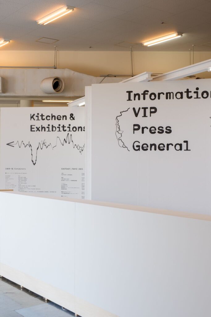
今も、すごい悩んで作ってるやつがあって。メインビジュアルとポスターを作るのと同時に、街中のサインの展開をいっぱい考えなきゃいけなくて。そうなってくると、街中にあった時に別のものに見える、浮き上がって見えることを考えると、シンプルな文字だと街中に紛れちゃう。特徴を作ることは大事。他かのところになさそうな特徴があるものにするのが大事だなと思いながらやってて。そうすると、EASTEAST_TOKYOもそうだけど、特徴のある文字を作ると画面に混み合いが生じる。
GROUP:
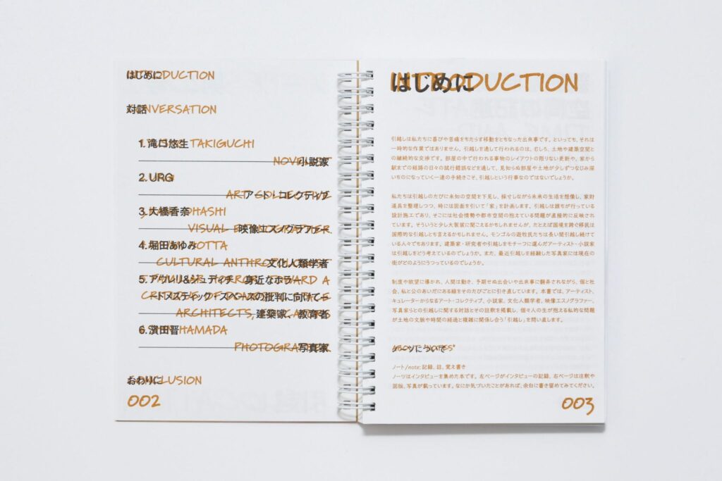
雑誌『ノーツ』は、名前の付け方から協働で作りましたよね。註釈がある本にしたいって相談して、「『ノーツ』はどうですか?」って話して、それでやろうってなって。その時に、左にインタビュー、右に注釈っていう構成も岡﨑さんが提案してくれたんですよね。雑誌のコンセプト自体が岡﨑さんとの打ち合わせで決まったようなものでした。
岡﨑:
うん。そもそも本を作るためにリソグラフを買いなよっていうところから。
GROUP:
そうですよね。作る方法自体から相談して、三田駅まで一緒にリソを見に行ったりしましたもんね。もう昔のことのように感じます。
岡﨑:
それでリソを買って雑誌を作った。
GROUP:
印刷機とか製本機とかも、全部岡﨑さんと相談しながら一巻目は作ってて。
岡﨑:
その頃はお互いまだ時間がたくさんあったから、いろいろ試しながらやりましたね。今とはだいぶ違う。
GROUP:
そうですね。岡﨑さんは今後どうするんですか?
岡﨑:
若い人はどんどん出てくるから、中堅枠に押し出されていっちゃうんですよね。今後の仕事の内容は、多分中堅的な仕事になる。
GROUP:
中堅的仕事っていうのはなんですか?
岡﨑:
最初は、本当に若い、まだ知られてない面白い人を見つけようっていう目を持ってる人にしか、たぶん引っかからなかった。でもだんだん、そうじゃない人の目にもつくようになってくると、自分と遠い人からも声がかかるようになる。そうなった時に、その違う人とどういうふうに仕事ができるか。そこかなと思うんだよね。
既に感じてるんだけど、自分たちと関わってる人の年齢層が上がってくる。周りにいるデザイナーの人たちの年齢層が高いとか。感覚が違う年上の人とやる仕事がうまくできるようになると、デザインも広がるのかなっていう気がする。それでいいのかは、ちょっとよく分からない。
GROUP:
これまで培ってきた特徴を変えないといけない可能性もありますもんね。
岡﨑:
全然違う方に行っちゃったなっていう人になるかもしれないから。どこでそのストッパーをかけたらいいのかが分からなくなりそう。
GROUP:
今のところはどう思ってるんですか?
岡﨑:
まあ、1回やってみるか、みたいな。そういうことができるかどうかを試してみようかな、という感じではいる。やってみたら意外と、制約があるけど自分らしさを実は出せる、っていうことがあるかもしれないから、それをやってみようかなっていう気はしてて。
感覚の合う、同じ年ぐらいの人たちだけだと広がりはしないかなって。広がりすぎたなと思えばやめればいい。難しいけどね。
対話から見えてきたのは、仕上げとは完成を閉じる行為ではなく、物がどの瞬間に、どのような存在として立ち上がるかを定める行為だということだった。印刷工程におけるテクスチャーの制御や、展示における立体化の試みは、平面を平面のままに留めず、情報を物質として扱うための実践である。
また、その仕上げは常に協働の中で更新される。相手のつくったものを受け取り、応答し、返すという往復運動のなかで、プロジェクトの輪郭は少しずつ変形していく。制約を引き受けながらも自らの感覚を手放さない姿勢は、平面と立体、完成と未完のあいだを行き来する。
本インタビューは、そうした仕上げの解像度が更新され続ける「途中」の状態を記録した。
Group Form – Part 3: “The Resolution of Finishing, How Materials Behave”
Interviewee: Mariko Okazaki | Graphic Designer
協働の輪郭 | Group Form is a series that moves between the fields of architecture and contemporary art, exploring how the process of collaboration affects works and projects. For Vol. 3, we invited graphic designer Mariko Okazaki to speak about finishing in architecture and graphic design as a starting point, the relationship between the flat and the three-dimensional, and how one’s work expands over time.
Graphic designer. Born in Tokyo in 1984. Graduated from Keio University and the Gerrit Rietveld Academie (Netherlands). After working at neucitora and village®, has been freelance since 2018, and founded REFLECTA, Inc. in 2022. Deeply engaged across cultural fields including contemporary art, performing arts, architecture, and fashion, she explores editorial and structural approaches to design grounded in observation and conceptual thinking. Recent projects include the 8th Yokohama Triennale and EASTEAST_TOKYO 2023/2025. In 2024, she received the JAGDA New Designer Award and the Tokyo TDC Award.
Website: https://reflecta.jp/
Mariko Okazaki (hereafter, Okazaki):
I think the first time you, Inoue-kun, reached out to me was about a monograph for a certain architect. And I guess the very first time we met was at Takeo Gallery in Aoyama, where there was an exhibition by the graphic designer Sumire Kobayashi.
Gaku Inoue of GROUP (hereafter, GROUP):
That’s right. I had been asked to edit a book for a certain architect, and I remember asking you whether it would be okay for me to recommend you as the graphic designer. But then COVID hit right around that time, and the book project ended up being cancelled.
Okazaki:
What surprised me first was the possibility that I—someone who had only just become independent—might end up doing a book for that architect. At the time I had really only been independent for one or two years.
GROUP:
He said he wanted to make the book with younger people, didn’t he. The timing of our independence was also close—around 2019. And since then, it’s felt like you expanded your field of activity incredibly quickly.
We worked together on various projects: Issues 1 and 2 of the magazine NOTES; the first and second editions of the art fair EASTEAST_TOKYO; projects at the National Museum of Modern Art, Kyoto; the Contemporary Art Museum, Kumamoto; the touring fashion exhibition “Love Fashion: In Search of Myself” that went to Opera City Gallery as well; the JAGDA New Designer Award Exhibition; and more.
GROUP:
Let’s start with the art fair we collaborated on most recently, EASTEAST_TOKYO. This time, we were conscious of designing the venue so that the effect of the graphic design could be maximized.
Okazaki:
Mm-hm. It really felt like things meshed well. In the middle of producing the graphics, you showed me the one-stroke exhibition plan that was already underway, and I started thinking further from there. This year there was basically no foothold compared to last time.
It was difficult because there were fewer starting points than the previous edition. Last time there were so many things EASTEAST_TOKYO itself wanted to do, and we were giving form to those. But this time, with a precedent already in place, if the philosophy was the same, figuring out how to change it was extremely hard.
Then I heard from the secretariat that the venue was likely decided, and I listened to the concept of the riverbank image and the exhibition plan where everything connects through a single continuous line. And then it became, okay, let’s align with that. This time the graphics were completely conceived from the venue design.
GROUP:
I see.
Okazaki:
And then GROUP adjusted to that again. I think the relationship—receiving what the other made and then returning something in response—worked really well. The venue was really good too. The previous edition was good as well, but this time it felt finer, and cleaner.
GROUP:
This time there wasn’t any “breakdown,” right. Last time we designed it so that even the backside was deliberately finished and shown, but this time we finished everything all the way through. That difference may have mattered too.
GROUP:
In architecture, the phrase “not finishing” can mean showing the substrate or leaving plywood exposed as-is. Is there a similar way of thinking in graphic design?
Okazaki:
In graphic design, maybe what corresponds to “finishing” is not over-polishing the final form. Like stopping one step before the end. There’s always a judgment about how fine to make the texture of something once it’s “completed” as graphics, and how rough to make it.
Even with typeface selection, you choose between something made to look clean and something made to look rough. If you want it rough, you might use some junky typeface you found lying around. And there’s also how much you let the base of the printed surface show through.
GROUP:
When you say “the base of the printed surface,” what do you mean?
Okazaki:
For example, with risograph printing like we used for NOTES, you get that look of the ink soaking into the paper. If you print a solid area, the ink sinks into the paper grain and you see mottling.
Even with offset printing, if you lower the screen ruling, you can produce a coarseness closer to silkscreen. You think about how something that’s perfectly smooth on a computer screen will transform through the printing process. Controlling the texture at the very last stage—that feels like “finishing” to me.
It’s about controlling the texture in the final process.
GROUP:
When I hear “finishing,” I imagine things like clever ways of putting up a poster, but I see it’s something much earlier than that.
Okazaki:
Because you usually can’t control where it gets posted. Normally you distribute it, and after that it can become pretty much anything. The final stage for graphic design is, after all, printing.
GROUP:
For the JAGDA New Designer Award Exhibition, the three of you—yourself, Shunta Sakamoto, and Shuta Yamaguchi—made the exhibition together. The only shared rule we set was the baseboard, and beyond that we took shape by listening to each person’s requests.
Okazaki:
With the New Designer Award, some people completely mix everything together and make one room, and others separate it. But we were completely separated.
GROUP:
We were completely separated. It was like doing three solo exhibitions—one for each person. We had to reflect each very different character in each room.
Okazaki:
All I told you was that I wanted to show lots of books opened, and that I planned to hang posters above. And then you proposed a structure for the fixtures that matched the pitch of the hanging posters. The baseboard was interesting too. Maybe no one noticed, but it was interesting.
GROUP:
Maybe only a few people noticed, but that’s fine too. Because the baseboards differed in each room, the atmosphere shifted a little.
Okazaki:
Each baseboard had the personality of the person.
GROUP:
We also thought through the bookshelf together while testing the dimensions and structure.
Okazaki:
At first it was like a Christmas tree.
GROUP:
Right. Then we refined it a bit more. It was a wide, horizontal bookshelf, right? If you build it normally, vertical members appear like columns. This time we placed that structure toward the back, and that structure ended up aligned with the arrangement of the posters hanging above.
Okazaki:
Yeah. It becomes like boards resting on a frame. With that bookshelf in the middle, it felt like a center formed within the space, which was good.
GROUP:
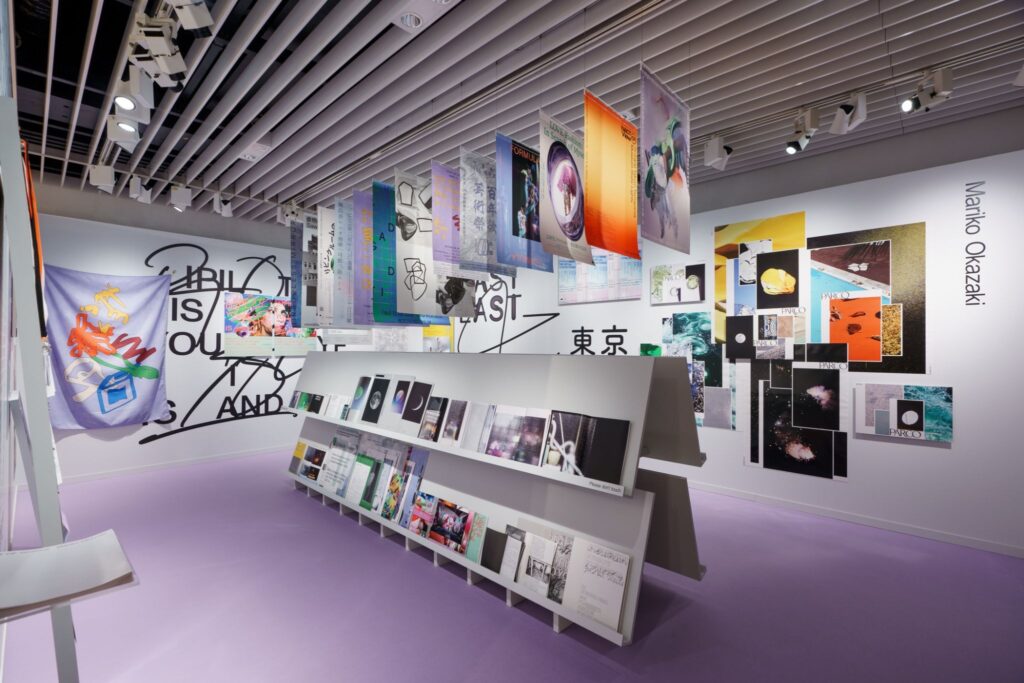
Your exhibitions mix in three dimensions within the room. And within that, how to shape the visitor’s circulation felt like a key point. I also thought the straightforward visitor path might be in contrast with your works that “mix” and overlap.
Okazaki:
In the JAGDA show too, I intentionally floated things or created floating layers. There were three modes—sticking things flat, mounting them slightly off the surface, and leaning them—and I made them overlap that way.
GROUP:
Even the hanging posters create a three-dimensional volume. And the books, too—normally they could just be wall-mounted, right. I feel a will to become three-dimensional. Why do you exhibit things three-dimensionally?
Okazaki:
Why is that, I wonder. For instance, even when we put posters on our company website, we roll the poster and lean it diagonally at the corner where the wall and the desk meet at ninety degrees. I want to photograph the poster as an object. I often put a lot of work into the very last printing stage, and we often use unusual papers too.
A lot of graphic designers present their work as flat images on a website—many just export a JPEG and post it. But I have this sense that, at the finishing stage, the same data becomes a different thing. So if the printed object is the “real” thing, bending it a little makes the light reflect and reveals the texture, and that’s why I photograph it that way.
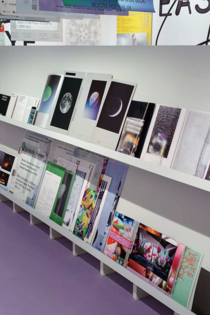
In exhibitions too, I want to show posters and books as objects, and maybe that’s why the exhibitions end up like that. We also talked about displaying books in ways that match their forms—laying them flat, rolling them, and so on. Even just opening a book changes completely depending on the paper, and it changes depending on the binding too, and the display made those differences really visible.
Book exhibitions often place books on an incline and cover them with glass, showing only the exterior; often you can’t see the inside, only the object’s presence. But we design the inside content as well in many cases, and we wanted to show all of that.
GROUP:
For the fashion exhibition, we also collaborated on the shoot for the key visual.
Okazaki:
I made a pretty unreasonable request. I asked you to place oval props in the front and back and build a tunnel-like space. On the other side there would be mannequins, and the setting was to create a “hole” that connects to another world. And the scale was big. A hole that connects the mannequins’ world and this side.
GROUP:
Right. It’s not like you couldn’t do it in 3D, technically. But you wanted to do it as a live-action shoot—was there a particular reason?
Okazaki:
If it becomes 3D, it becomes a lie—or rather, it would probably be too easy to do. When you make it in 3D, it looks fake. The premise itself—that there’s a different world beyond the hole—is already a fiction, so if that fiction is made out of fiction, it becomes just a lie. I thought it would be interesting if it could be made to feel real. That’s why we even ordered the wallpaper and put it up.
GROUP:
Hardly anyone noticed, right.
Okazaki:
No one noticed the difference in wallpaper. But the photographer, Gottingham-san, shot it in extremely high definition. He captured the texture.
GROUP:
The balance in Gottingham-san’s photos is interesting too. He photographs real things, but they can feel slightly 3D-like—he brings out a kind of “fake-ness.” That sense of balance is fascinating. Between fully building everything in 3D, making live-action feel 3D-like, and doing everything purely live-action—there’s definitely potential in the balance between those approaches.
GROUP:
In architecture, there are times when “not finishing” actually costs more. For example, even if you say you’ll finish with shina plywood, if you sand it extremely carefully and use a high-quality coating and then declare “this is the finish,” it can cost more than simply finishing with wallpaper.
Okazaki:
In graphic design, something similar happens in the binding process. For example, if you want to expose the spine intentionally, manual labor can be required. In a normal process you glue the spine, but sometimes you even peel off glue that was applied by machine. If you do that, it becomes a huge ordeal. When you want to make something look rough, it can end up becoming more expensive.
GROUP:
The architect Lina Bo Bardi used the term “Arquitetura Povera,” which I guess you could translate as “poor architecture.” I’m interested in what “poor” could mean in architecture. I feel that if you reduce the number of materials and make something simple and sharpened, it costs money. When there’s no money, I imagine cheap decoration tends to become excessive.
Okazaki:
That can happen. In the city too, I feel like I often see things where decoration increases excessively. But I don’t think there are many “cheap” things that are minimal and sharpened, right. If you make something minimal in an ordinary way, it just becomes something cheap—something that only looks cheap.
GROUP:
Exactly. So if you try to create something good while also keeping it “unfinished,” as people say, it ends up being expensive anyway.
Okazaki:
And that’s not really because it becomes cheaper or anything, but more an aesthetic issue—plainness, or a sense of resistance to luxury. It’s an issue of taste: you think plain things are better, so you want to do that. It doesn’t necessarily have much to do with practical rationality.
GROUP:
Right. It’s an aesthetic value system separated from the flow of money. Against established luxury, there’s a simple direction, but there’s also a direction where you stack information as an excessive decoration. In your work too, you sometimes layer information to create new forms and colors, don’t you?
Okazaki:
It may be that I like things with more information rather than something simple and refined. The result becomes that way. Mixing different elements into a single screen, combining things that don’t match at all. In graphic design, the composition itself doesn’t really cost more or less money.
Once I have a big idea, I don’t obsess over the details that much. When I’m thinking of an idea, I often make it by combining opposing things, and then, like in the Yokohama Triennale or the Pipilotti Rist exhibition, I combine something tight with something not tight, complexity increases on the screen, and in the end it becomes kind of messy.
GROUP:
I felt that “messiness” exists like the two sides of a coin with minimalism as resistance to luxury.
Okazaki:
There’s minimalism against lavish ornament, and minimalism has now become luxury, and then, against that luxury, things become messy again. In graphic design, people a bit older than my generation tend to go in a minimal direction.
I did fairly minimal work at first, but the reason I’ve gradually moved away from that might be because I’ve been influenced by what’s around me. But my graduation project was also something where a huge amount of complex information was packed in tightly, so maybe that was there from the beginning.
GROUP:
In the exhibition you did soon after becoming independent, every project that was shown was layered and complex, wasn’t it.
Okazaki:
So it was that way from the beginning. The exhibition was like that, and even an early PARCO project—I mean, normally a commercial poster is a big photo printed full bleed with a logo or a headline set large. But in one large B1 sheet, I placed small white “screens” of different paper sizes like A3 and B2, and within those I laid out the photos without cropping them, and then placed the logo there—basically nesting the typical poster layout and breaking it. I did that kind of thing early on.
When I was in university in the Netherlands, there was, as a general tendency, a lot of work where you put various images with completely different textures into a single frame. Even students in the photography department, around the year 2000 when I was there, weren’t taking photos—rather, as found photos, they were gathering images of different textures from the internet. That might also be related to the “messiness” I make.
GROUP:
As minimal and messy alternate as a historical flow, technology changes too. I wonder what will happen with younger generations of graphic designers. Did you go to the exhibition at A-Soko (A Warehouse)?
Okazaki:
I did. Even the younger people in our office feel programming is pretty close to them, and many of them go toward motion. Maybe they’re going toward video rather than still images. People like Tsunoda-kun, who was showing at A Warehouse, and Sakamoto-kun, who won the New Designer Award with me, can do programming. I feel like more people are thinking continuously across motion.
GROUP:
True—on Instagram there’s a lot of moving stuff too. So you get requests like that, right? “Please give us something that moves.”
Okazaki:
Probably, yes. Sometimes.
GROUP:
And the Yokohama Triennale visuals were moving too, right.
Okazaki:
They were moving. With what little technique we have, REFLECTA sometimes makes moving pieces too. When you make something moving, you end up treating one frame from within the video as the still image—you take one element out of the series. That was exactly the case for the Yokohama Triennale too, and it feels like it’s “in the middle of moving.” That way of thinking might change. There’s a difference between composing a poster as a still image in one decisive frame, and choosing a moment as a still from within motion, versus composing it from the start.
GROUP:
This may or may not be related, but at the Yokohama Triennale there was also a development across scales, right. You expanded graphics onto construction hoardings and so on, and even if you cut out just a part, you could recognize it immediately as your graphics. Like graffiti—so that even if you take a fragment, you can tell what the sign is. I thought that was really interesting.
Okazaki:
Even with something I’m working on now, there’s a project I’m struggling a lot with. I have to make a key visual and posters, and at the same time think through a whole expansion of signage across the city. When you consider how it should look different in the urban environment—how it should rise up or stand out—simple lettering will blend into the city. Creating a distinct feature is important. I keep thinking it’s important to make something with characteristics you don’t see elsewhere. But when you make distinctive letters—as in EASTEAST_TOKYO too—the screen gets crowded.
GROUP:
For NOTES, we collaborated even from how to name it, didn’t we.
Okazaki:
Yeah.
GROUP:
We talked about wanting to make a book with annotations, and said “How about NOTES?” and decided to do it. And the idea of putting the interview on the left and the annotations on the right was also your proposal, wasn’t it. NOTES was something where the concept itself was decided through our meetings.
Okazaki:
Yeah. It started with me saying that risograph would be good for making the book, so you should buy a risograph.
GROUP:
Exactly. We talked from the method of making itself, and we even went together to look at risographs.
Okazaki:
We did. We went all the way to Mita Station to go see it.
GROUP:
It feels like a long time ago.
Okazaki:
And then you bought the risograph and made it.
GROUP:
And for the first issue, we consulted with you about everything—printing machines, binding machines, all of it.
Okazaki:
Yeah. Back then we both still had time. We really took time and did it.
GROUP:
We tried so many things, in the beginning.
Okazaki:
Don’t you feel it’s quite different now?
GROUP:
Yes, it’s quite different.
So what are you going to do from now on, Okazaki-san?
Okazaki:
Younger people keep coming up, so you get pushed into the “mid-career” bracket, right. In terms of what the work is like, it will probably become “mid-career-type work.”
GROUP:
What does “mid-career-type work” mean?
Okazaki:
At first, I probably only resonated with people who had the eye to find young, unknown, interesting people. But as more people notice you—people who aren’t like that—you start getting calls from people who are far from you. And then the question becomes: how do you work with people who are different. That’s what I think it is.
I already feel this, but the age range of the people I work with is getting older. The age range of designers around me is higher. If I can work with older people whose sensibilities are different—and if I can do it well—then I feel my work could expand from here. I’m not sure whether that’s good, though.
GROUP:
Because there’s also the possibility that you’d have to change the characteristics you’ve cultivated.
Okazaki:
Yeah. I might become someone people think, “She’s gone in a completely different direction.” And I might lose track of where to put the stopper.
GROUP:
What do you think right now, at this point?
Okazaki:
Well, it’s like, maybe I’ll try it once. I feel like I want to test whether I can do that. And if I try it, it might turn out that even within constraints, I can actually express something that’s still mine. So I feel like trying. If I only work with people around my age whose sensibilities match mine, I probably won’t expand. If it feels like it’s expanded too far, I can stop. It’s difficult, though.
Through the conversation with Mariko Okazaki, it became clear that finishing is not an act of closing a work, but rather an act of determining the moment at which an object comes into being, and the manner in which it does so. The control of texture in the printing process and the attempt to give form in three dimensions through exhibition are practices that refuse to confine the work to the flat, treating information as something material.
At the same time, finishing is continually updated through collaboration. Within the back-and-forth movement of receiving what another has made, responding to it, and returning something in turn, the contours of the work are gradually transformed. A stance that accepts constraints while refusing to relinquish one’s own sensibility appears here as a mode of thinking that moves between the flat and the three-dimensional, between completion and incompletion.
This interview records such a moment in which the resolution of finishing remains in flux.